Other business owners wondering what kind of layout / designs do they really want for their business website. Now we have a list of website layouts for you to get some ideas to get started. See below
There are lots of small businesses websites built with Divi to provide design inspiration for your next project. In this article we will take a look at 11 examples of Divi small business websites to help you with design ideas for your next Divi project.
1. J-Tech Solar
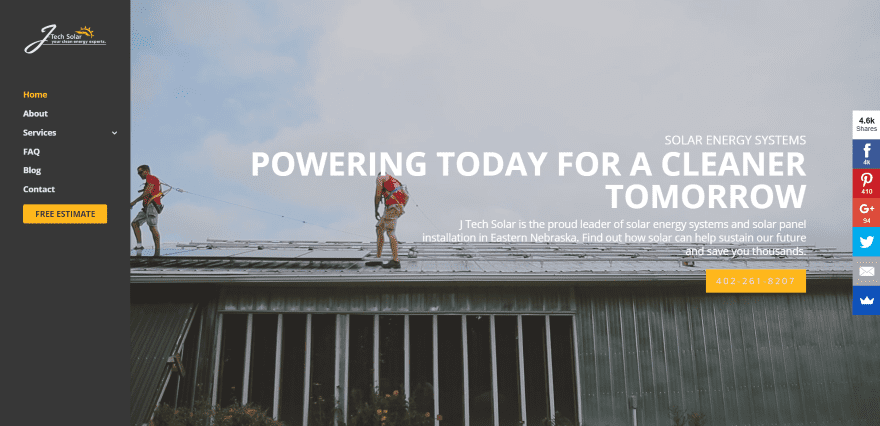
J-Tech Solar uses a full-screen video background with tagline, company information, and clickable phone number in an overlay. It has a vertical menu with CTA. Following this is a three-column section with links to industries served, an about section with CTA that uses a partial overlay over a full-screen image, and a four-column information section with text. The next section displays one of the most interesting uses of parallax that I’ve seen – it includes a full-screen background image with text cutout using both positive and negative space. The first line of text blocks the background while the second line of text reveals the background. After this is another CTA with an overlay and a custom footer with contact info to the right side. The site makes excellent use of color, images, video, and parallax.
2. Fixheat

Fixheat displays a full-screen image with blue overly that includes the logo, tagline, CTA’s, and icons of services provided in true parallax. The menu is revealed on scroll. Following this is an about section that includes an image against a white background and link to read more. Services are shown as large icons over a background image in true parallax. A CTA is placed over a dark gray section. A custom footer shows logos over a darker gray background. The site makes excellent use of color and fonts.
3. Non Standard Forms
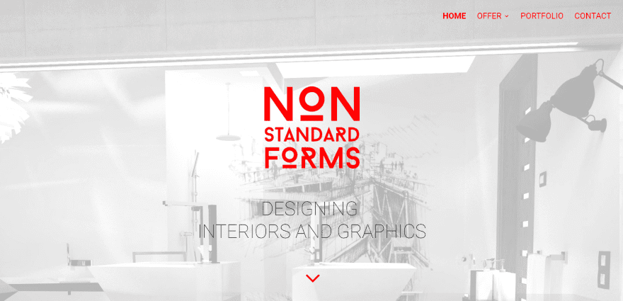
Non Standard Forms displays a full-screen image with logo in an overlay in true parallax. A three-column section shows the services provided with large images in monochrome and styled links. The next section shows a full-width testimonial in large red print. Following this is a portfolio slider, a full-screen testimonial slider over a background image in true parallax, and a contact form. The Portfolio page places each of the services over different colored backgrounds. The site makes great use of color, backgrounds, and fonts.
4. Sardis Tire and Auto Works

Sardis Tire and Auto Works includes a full-screen image with tagline and CTA. Scrolling reveals a full-width about section with bold yellow background, a full-width section with images of technicians working in the shop. Another full-width section includes links to the services provided using hover animation. A contact section includes a contact form and a map over a dark blue background. The menu links are extra-large and look great with the site’s design. The site makes great use of color-branding and fonts.
5. Adam Alan Painting and Contracting
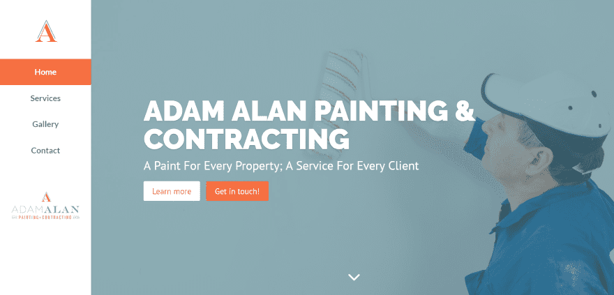
Adam Alan Painting and Contracting includes a left side vertical menu. It includes a full-screen image with title, tagline, and CTA’s in parallax. The next section gives info of the company over an orange background with triangle section styling. This is followed by an about section with images, icons, and text describing the services provided. Photos of homes are shown in a full-width section followed by a multi-column testimonial section. A contact CTA is placed over an image with orange overlay. The footer includes a BBB certificate. The site makes good use of color.
6. Maiden Jane
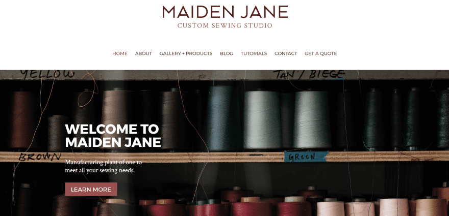
Maiden Jane uses a large logo above the menu and includes a full-screen image with welcome message and CTA in parallax. Scrolling reveals a multi-column section with images and backgrounds with links to the various pages. A custom footer displays the logo, social buttons, and contact info over a pink background that matches the branding. The Get a Quote page uses an embedded Typeform where you can choose the type of products you’re interested in. The site is simple and uses a clean design.
7. Schlosserei Schneider
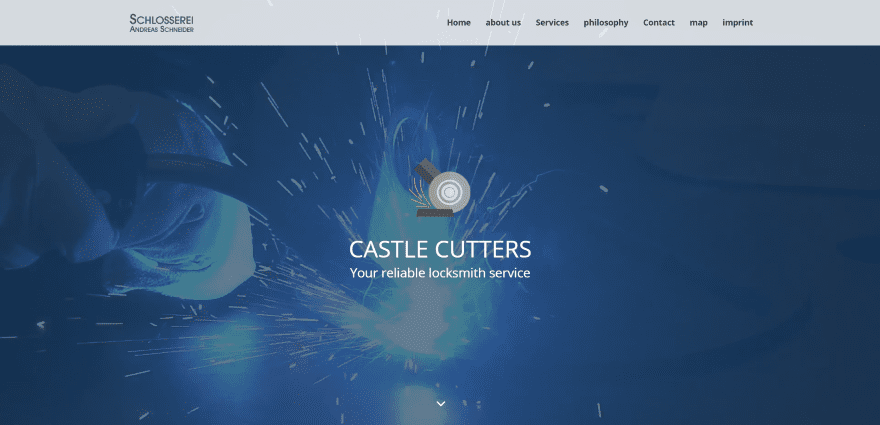
Schlosserei Schneider (Castle Cutters) uses a one-page design that displays a full-screen cinemagraph background with title and tagline in an overlay. The next section displays company and contact information followed by a large section in three columns with a photo of the owner in the center and descriptions of the services in the outer columns. The next section includes three sliders with images of work followed by a full-with section with image and contact info, a contact form over a full-width background, an image gallery, a full-width scrolling map, and information in the footer. The layout is clean and easy to follow.
8. Handyman I.O.W.
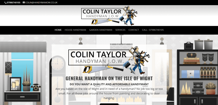
Handyman I.O.W. uses a one-page design that displays a large logo above the primary menu that includes a clickable phone number, and a large graphic background with logo, information, and read more button in an overlay. The next two sections include alternating images and text and include a clickable phone number. A full-width section displays the services over an image in parallax followed by contact information, a map, and contact form over an image in parallax with an overlay. The sites make good use of clickable phone numbers as the call to action.
9. Land Care and Irrigation of Lake Norman
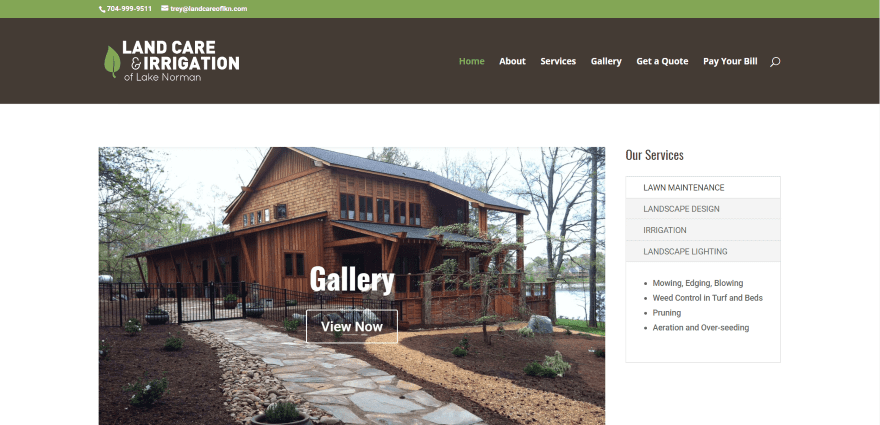
Land Care and Irrigation of Lake Norman includes a slider for the Services, Gallery, and Get a Quote pages with a button to view more followed by a CTA in a green box the width of the slider. The sidebar has a widget describing the services. Clicking on each of the services displays the details in the bottom portion of the widget. The pages include the CTA in the sidebars and use toggles for information and a multi-layout gallery for images. The quote and payment pages are powered by Custom Contact Forms. The site is simple and makes great use of branded color.
10. East Coast Doors
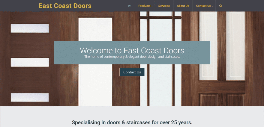
East Coast Doors displays a full-screen background image with welcome message in an overlay and contact CTA in parallax. Scrolling reveals company information with phone number with triangle section styling. Products are displayed in three columns with links. Another section displays products in a list format with sales info, a full-width section with CTA, and a footer that’s revealed on scroll. Navigation is powered by Uber Menu and shows products, product categories, and a contact form within the megamenu. The site makes great use of product photography and has the most interesting menus on the list.
11. Pro Data Management
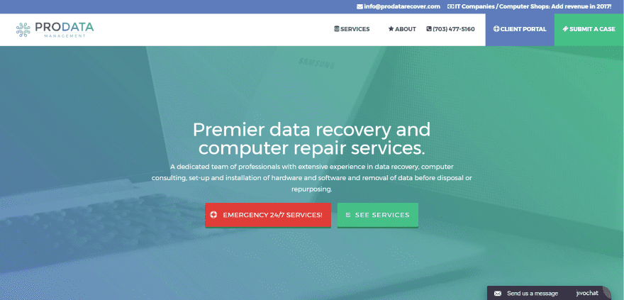
Pro Data Management uses a full-screen background image with a gradient overlay that includes company info and CTA’s. The next few sections display three icons with links to their corresponding services, which are separated by type. The next section displays certification logos of the employees followed by a CTA and footer with CTA, info, and menu. A chat box remains on screen. The menu includes CTA’s and a clickable phone number. The menu items include icons. Cases are submitted through embedded Simple Forms. The site makes excellent use of overlays and color, and has a sharp menu.